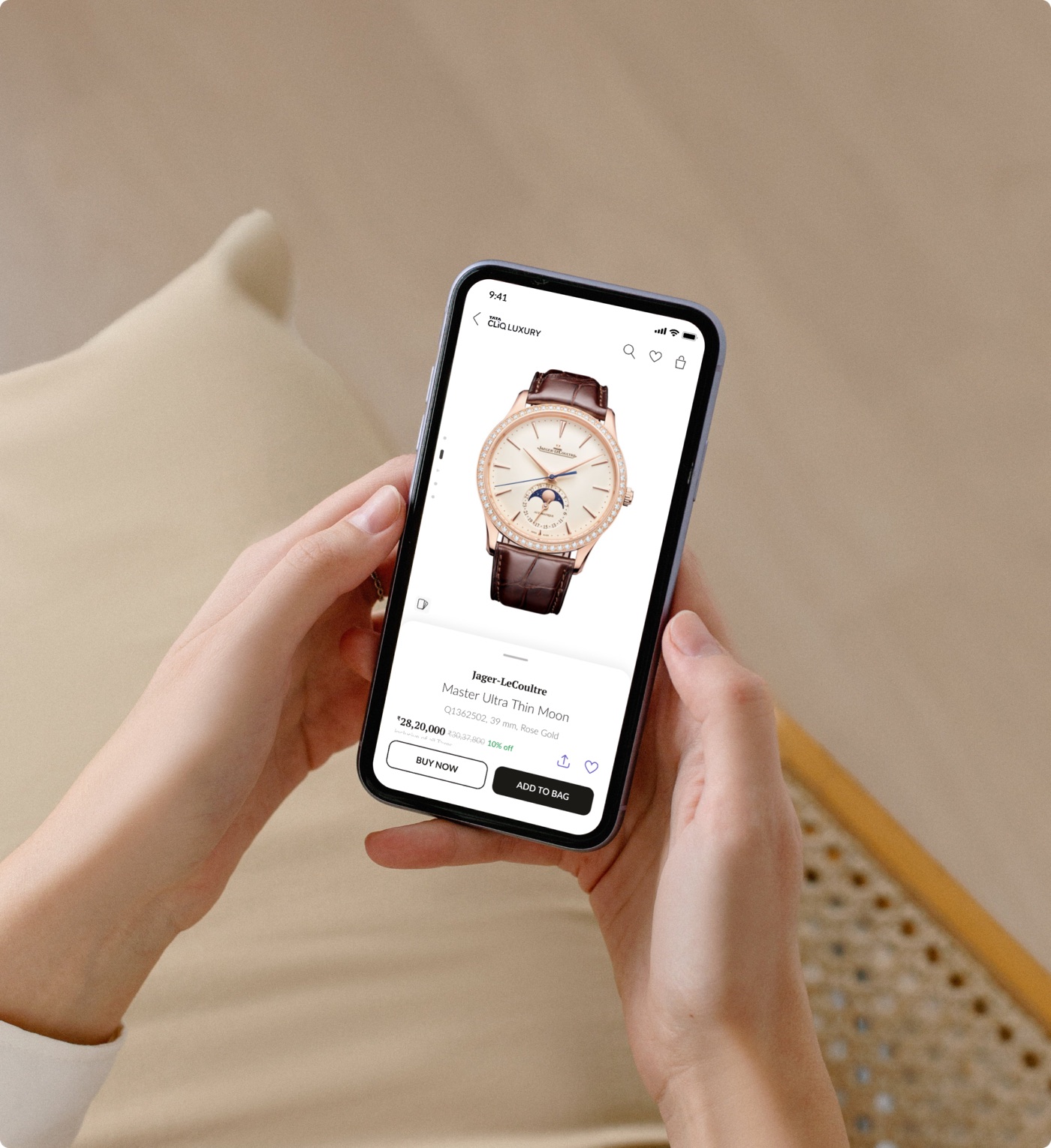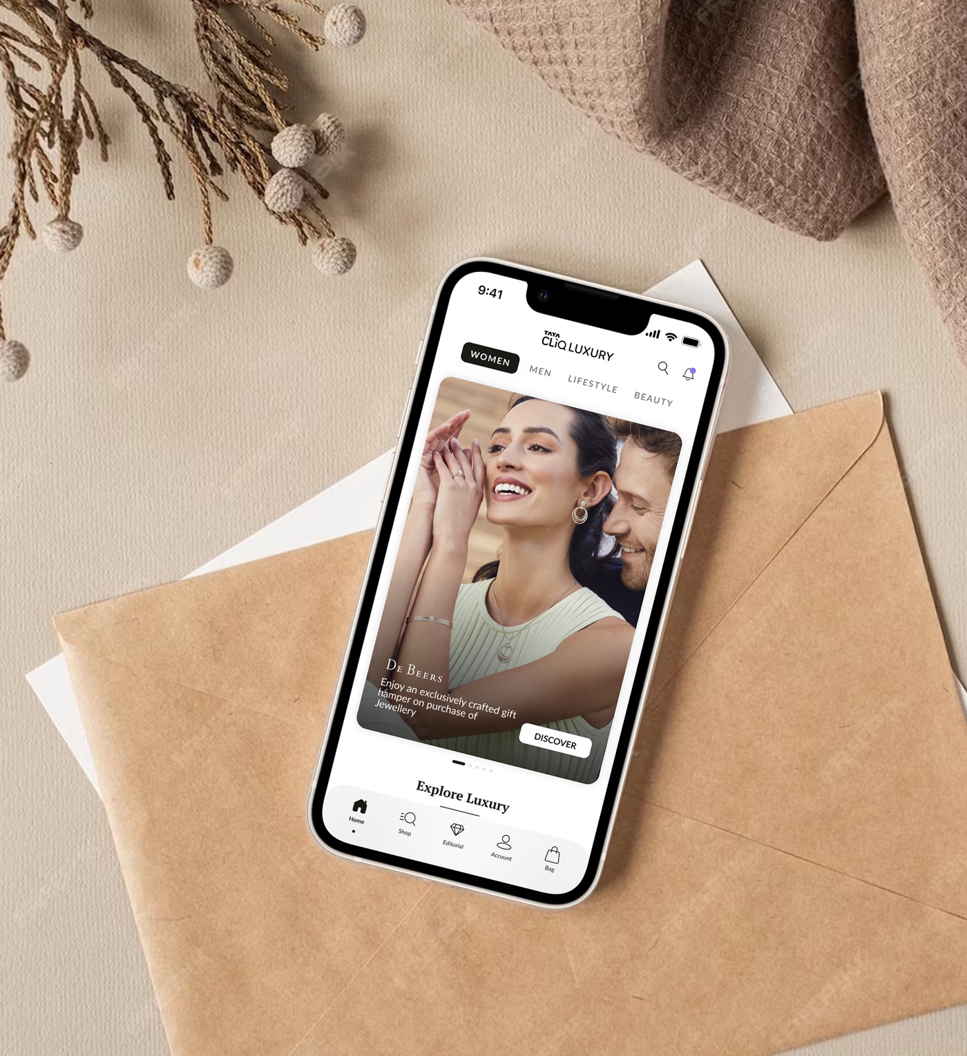
A homepage that couldn't keep up with the business.
Tata CLiQ Luxury grew fast. Each new offering became another row on the homepage, and the page kept getting longer while fewer people scrolled down it.
My job was to set the vision for a world-class luxury homepage, and deliver it.
Bringing focus to a vast, open-ended brief.
Business, marketing and creative each arrived with their own wish list. I sat with each team until we could name one core problem per team. Three clear problems are easier to solve than one big, vague one.
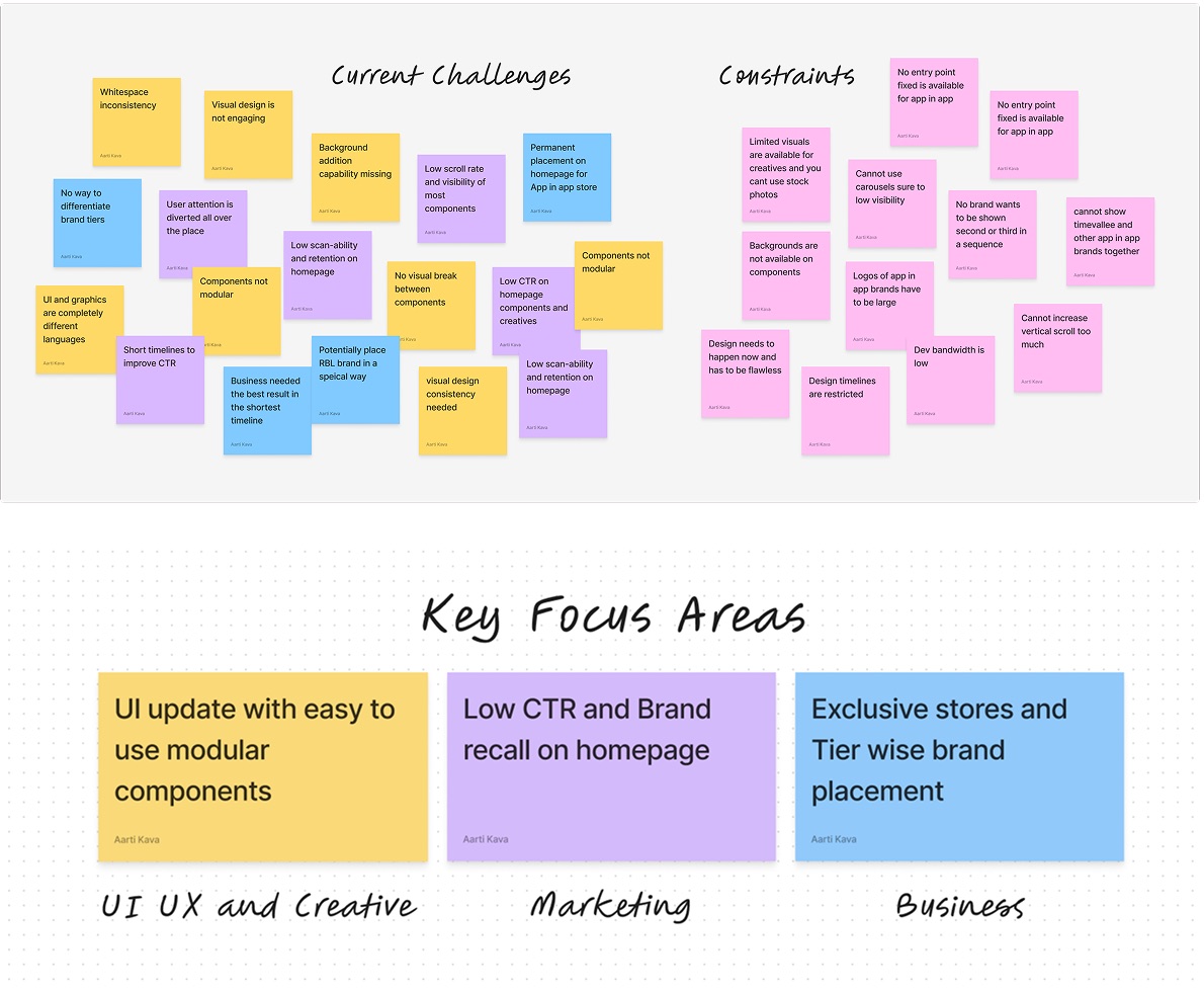
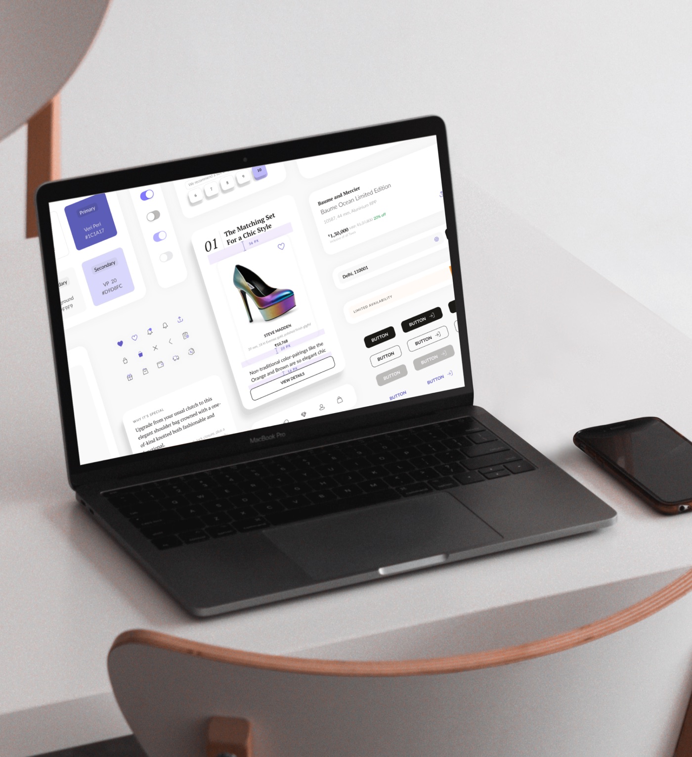
- Design modular components with function and flexibility in mindNew components had to flex with changing business and marketing needs and adapt to graphic themes, without frequent design or development work.
- Improve engagement on the homepageLow click-through below the second fold showed the content wasn't being presented well.
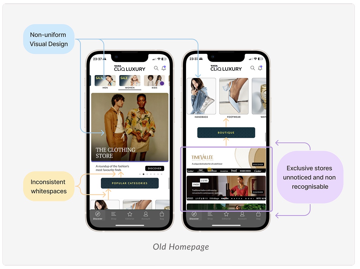
- Increase visibility for exclusive global brand storesThe app's exclusive international brand stores were hard to find and needed a proper showcase.
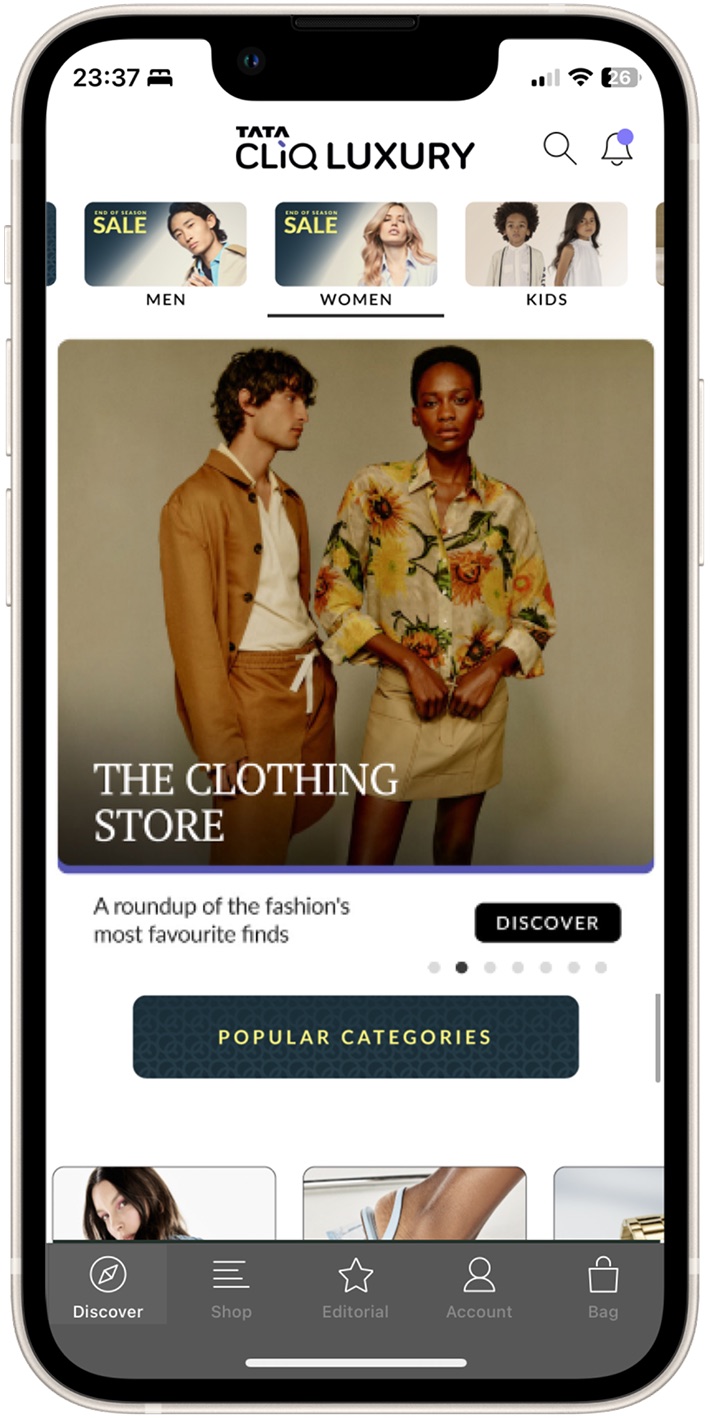
40% of taps went to one choice: men or women.
A quick expert review, checked against analytics and attention maps, showed where people looked, and where they didn't.
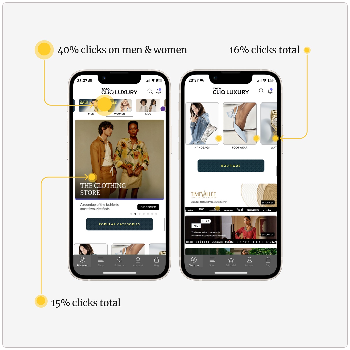
- 40% of clicks went to the Men and Women quick linksPeople wanted to filter what they saw by gender right at the start of their journey.
- 16% went to brand-focused hero bannersPeople were sometimes curious about what their favourite brands had on offer.
- 15% went to the popular categories carouselPeople valued a quick, easy route to the categories they were looking for.
We split one vague brief into three problems, and solved them in parallel.
To make the scope manageable, I broke it into focused pieces the team could explore in parallel:
Visibility for app-in-app stores
Give the exclusive brand stores a place to shine without crowding the page.
Homepage engagement
Make the first two folds do the work the whole page used to attempt.
Structure & components
A modular system the business can refresh without design or dev help.
Giving the exclusive brand stores a place to shine.
We explored many directions, then tested them with the business and creative teams. Their limits became our design brief. Working alongside them, not presenting to them, got us to one answer everyone could stand behind.
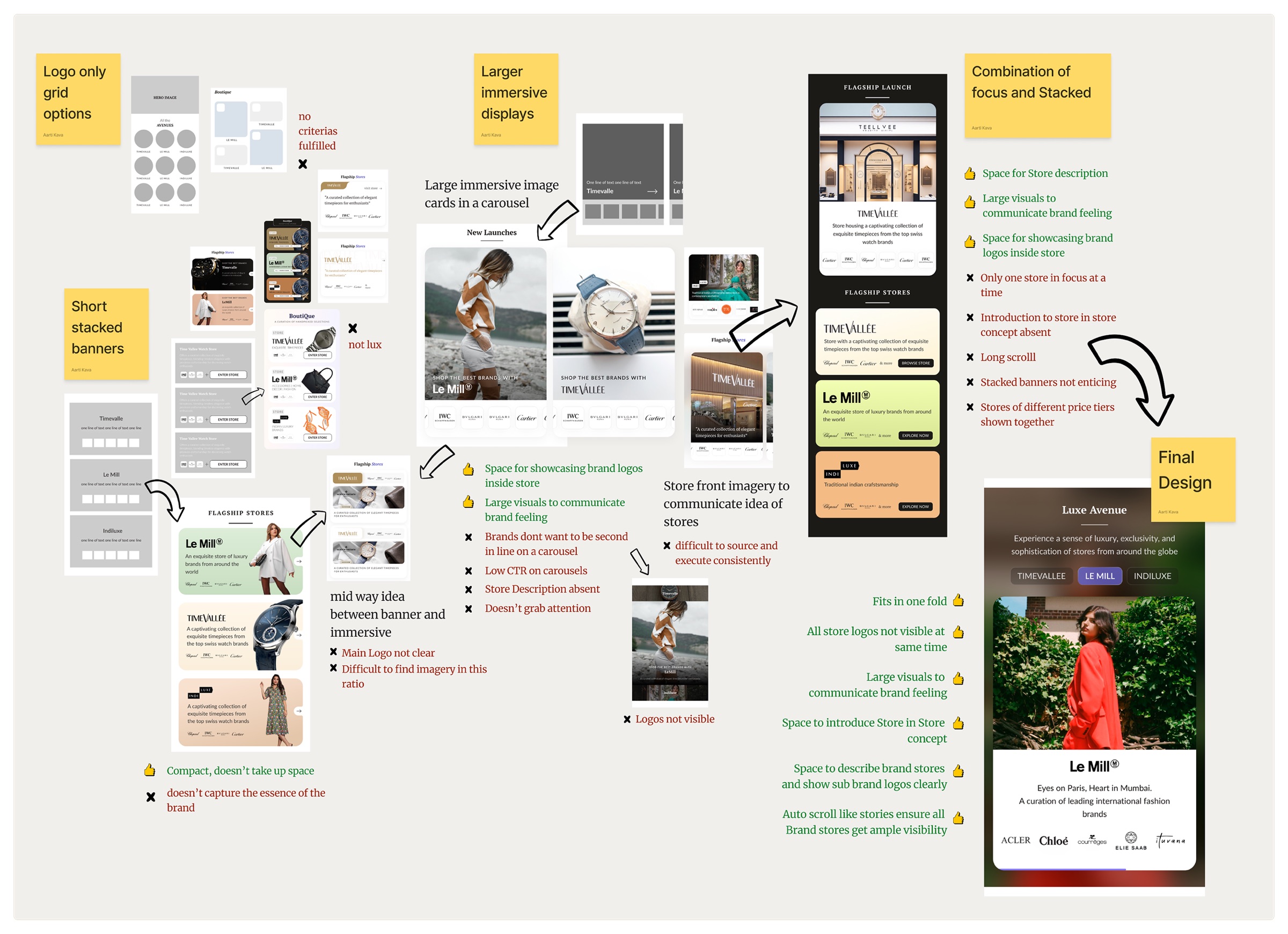
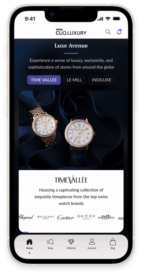
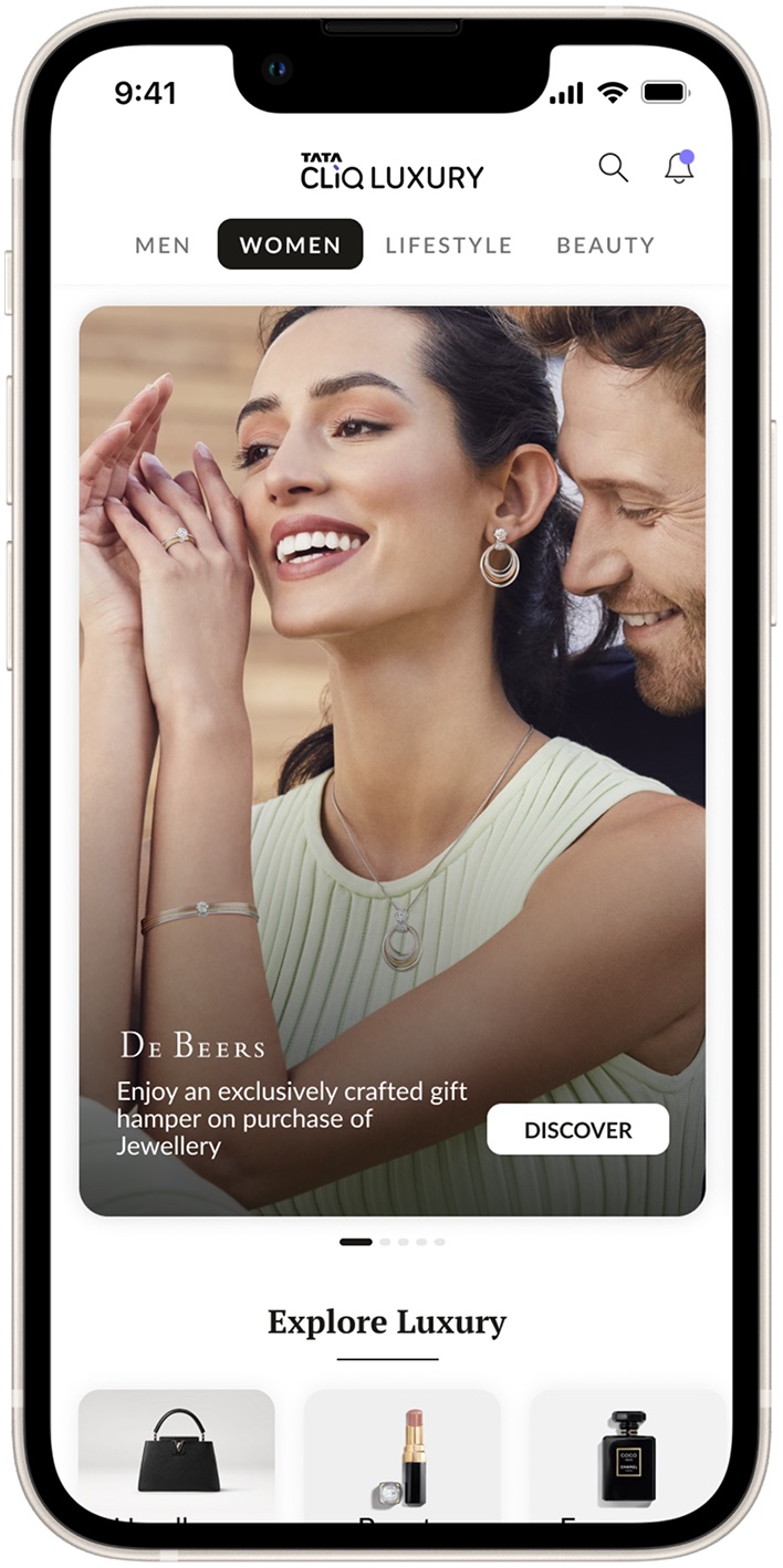
An immersive showcase for the exclusive global brand stores.
It met every constraint the business raised, and the brands loved it.
- It solved store adjacency and put sub-brands in focusOne immersive component brought attention to the exclusive stores and the brands inside them, and solved tier-wise placement.
- Timed auto-transitions kept every store visibleStore details sit behind tabs, but story-like timing meant discoverability didn't suffer.
- Engagement rose 300%A permanent focal spot on the third fold put far more eyes on our flagship brand stores.
Relevance first, then everything else.
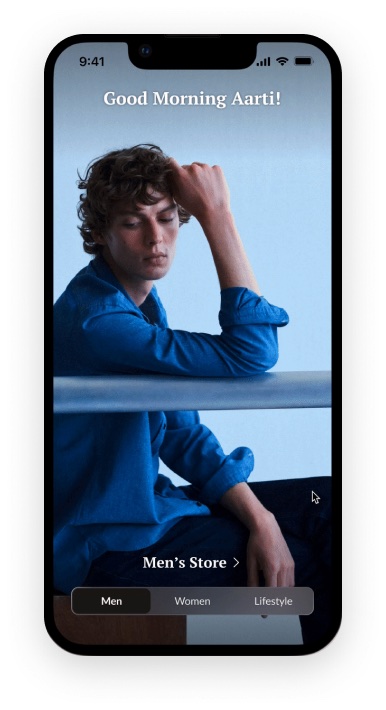
Insight. People wanted relevant content from the start, which the gender choice at the top of the journey showed clearly.
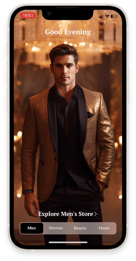
Idea. Ask people what they're looking for on first launch. It gives them relevance while keeping business offerings visible.
Experience. On first launch, people pick the store they came for. That becomes their homepage next time, and they can switch anytime. Only the men's and women's homepages become defaults, so the full offer stays in view.
Engaging, dynamic, modular, and easy to refresh.
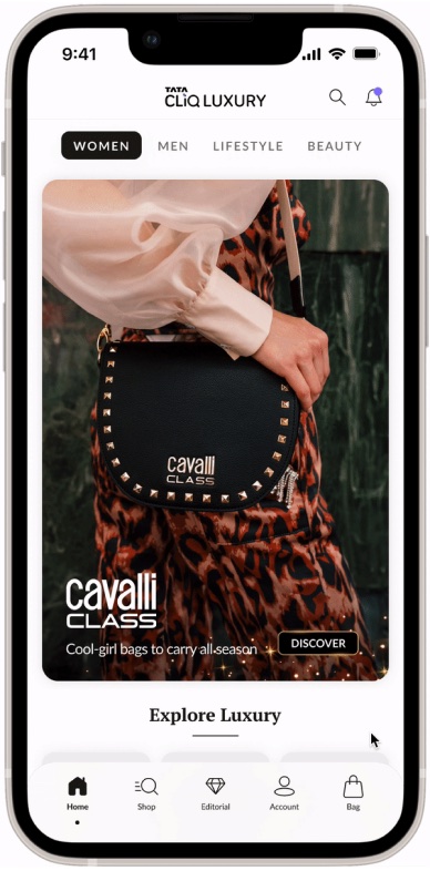
- Everything important within the first two foldsSwitching between contextual homepages, catching up with favourite brands, and reaching every product category, all without scrolling far.
- Modular component designFlexible enough for the creative team to use themes and occasions fully, and simple enough for teams to update without errors.
- New ways to group and showcase brandsComponents that let business teams cluster brands from different tiers and show them in distinct ways.
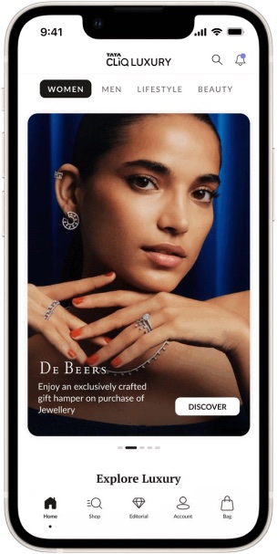
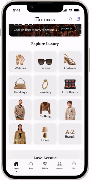
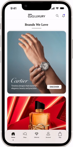
A design only works if the people running it understand it.
My job didn't end at handoff. Through training sessions and one shared spec document, creative, category, content and merchandising teams all worked from the same source of truth.
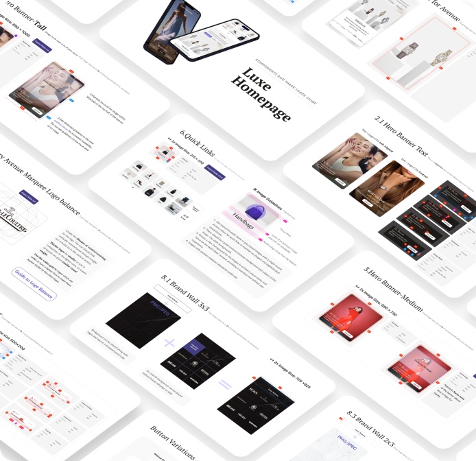
What changed, and what made it work.
Active data tracking and stakeholder management were critical to our success.
Teams that had never worked closely started working together. We tracked data from day one, tested against a control group and watched behaviour, so we could fix problems before they grew.
Page views per visit also fell by 10%, alongside the rise in listing views and conversion.
Key contributions
- Aarti Kava: Project lead, UX & UI design
- Anaya Purandare: UI design & documentation
- Aryan Kandhari: UX research & UI design